New York, tennis and visual culture: from Queens to the city walls · Cédric des Lauriers
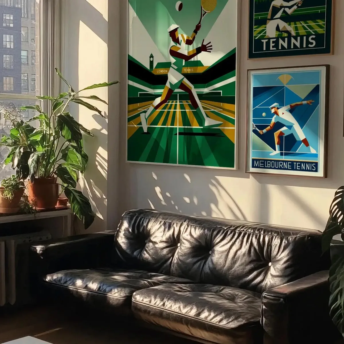
At the end of summer, New York changes pace. Racquets travel on the subway, public courts stay busy until evening and Queens becomes the centre of a spectacle followed far beyond the stands. Tennis is at once a sport, an urban ritual and a graphic language.
A tournament drawn like the city
Deep blue courts, electric yellow accents and white lines form an image that reads instantly. The palette echoes New York signage: direct, high contrast and designed to be understood in motion. On a poster, one diagonal can suggest a serve, a ball or the speed of a rally.
New York tennis graphics work like the city itself: quick to read and impossible to mistake.
From private club to neighbourhood court
Tennis long carried the codes of the private club. New York moved them into public space. From Riverside Park to Flushing Meadows, the game also belongs to neighbourhoods, schools and weekend players. Clothing follows that shift: the graphic tee leaves the stands, enters the street and becomes a living memory of the season.
Why posters and clothing belong together
A poster freezes the gesture. Clothing puts it back in circulation. Together they tell sporting culture better than a logo alone: the poster sets the mood in a room, while the garment carries the composition through the city. That conversation between interior and street guides the Paris Poster New York Tennis collection.
- Choose a large format to preserve the strength of diagonals and colour fields.
- Pair deep blue, cream and yellow to recall the court without making the room too literal.
- Match a structured poster with a garment whose motif stays legible in motion.